The design and placement of Disney trash cans teach us how to create successful calls to action for websites, landing pages, and sales pages.
Disneyland, Disney World, and other Disney Parks are divided into themed lands: Frontierland, Fantasyland, Adventureland, Tomorrowland, Star Wars: Galaxy’s Edge, MIckey’s Toontown, Main Street USA, and New Orleans Square. Each land has a unique theme that dictates every detail, including the visual elements, characters, costumes, rides, colors, architecture, stores, restaurants, landscaping, sounds, and even smells.
When you enter a new land at a Disney Park, you are completely immersed in that world. Every minute detail is accounted for down to the design and position of the trash cans.
Blend In Or Stand Out
Some trash cans on Disney Properties are meant to stand out and be part of the themed experience, while others are meant to blend in with the surroundings and go unnoticed.
Go Away Green
Disney Imagineers created a special paint color called Go Away Green. This paint color is used to make things around their properties blend in with the landscaping and almost disappear from sight. Elements of the park that don’t contribute to the magic or a land’s theme are painted this color so visitors don’t notice them.
Disney trash cans are painted Go Away Green when their position isn’t critical to or part of an experience. For example, nearly all of the trash cans throughout the Downtown Disney District are painted Go Away Green and feature understated designs. With this approach, guests don’t necessarily notice the trash cans until they need one.
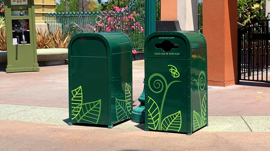
Enhance The Magic:
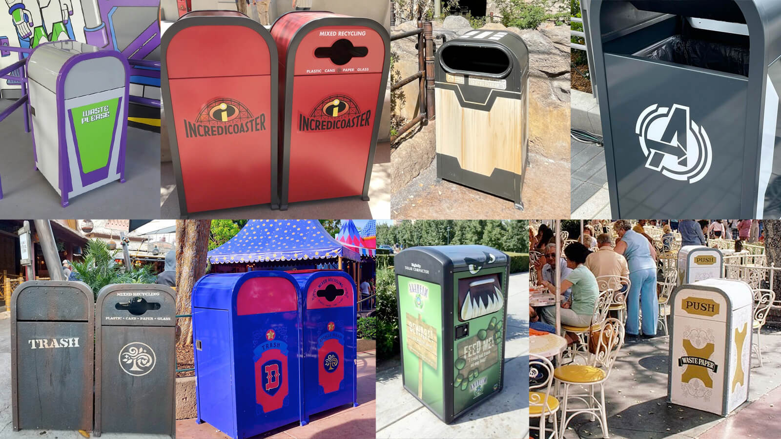
When trash cans are placed within a Disney experience, like within a ride, a restaurant, or a themed land, the garbage bins get a unique design so they become part of the experience and add to the magic rather than detract from it.
Some Disney trash cans are even meant to attract attention and sites like Magical Trash document them! Across the internet, you’ll find park visitors seeking out and snapping photos with themed trash cans in Disney parks and properties.
Call To Action Design
To keep visitors focused on the magic of a Disney experience:
- Elements that distract visitors are designed to blend in and create a seamless experience.
- Elements meant to capture attention are designed to stand out.
When it comes to website design and the design of landing pages and sales pages, the same methodology applies:
- Limit or remove all distractions to keep visitors focused on the copy and message.
- Ensure the page copy, imagery, colors, typography, and design elements feel cohesive, seamless, and well-planned and create an experience for visitors.
- Use a different, high-contrast “action color” for buttons and calls to action so they stand out and capture attention.
For example, if you take a look at the Profitable Project Plan or Content Creators Club sales pages on this site, you’ll notice that the buttons and calls to action are a high contrast bright pink that you can’t ignore.
But colors and designs aren’t the most intriguing things about Disney’s trash cans…
Disney Trash Can Placement
The most important lesson everyone, especially web designers, web developers, and digital entrepreneurs can learn from Disney’s trash cans is a lesson about placement and positioning.
Have you heard of the 30-Step Trash Can Rule?
When visiting Disneyland, you will never be more than 30 steps or 30 feet away from a trash can.
You see, Walt Disney knew that if park visitors had to work and expend effort to put their trash in a trash can, they would instead just drop it on the ground. To encourage people to use the trash cans, they had to be perfectly positioned so throw trash away would be convenient and easy.
There are a few different stories floating around about how Walt settled on 30 steps.
- Some people say Walt went to other amusement parks while designing Disneyland and counted how long someone would hold a piece of trash before dropping it on the ground. The number was 30 steps.
- Others claim Walt himself did a little experiment. He purchased a hot dog at Disneyland, ate it while he walked, and stopped when he finished the hot dog. He had taken about 30 steps and needed a trash can.
- Another story explains that Walt and his team removed all trash cans from Main Street before handing candy and snacks to guests as they entered the park. They then watched and counted how many steps people took before dropping their wrappers on the ground. The answer was, of course, about 30 steps.
This is why there are more than 1,000 trash cans in the park, and why it’s one of the cleanest amusement parks you’ll ever visit (and partly why my husband likes it so much).
Call To Action Placement
Walt knew that if he wanted people to take action and put their trash in a trash can, the trash cans needed to be in the right spot. He knew that to prevent littering in the park, there needed to be a trash can readily available when a guest had garbage to get rid of, and using a trash can needed to be quick and effortless. This meant that they needed a lot of garbage cans!
When it comes to the placement of calls to action on your website, landing pages, and sales pages, once again, the same methodology applies:
- When a prospective client or customer is ready to take action, make sure a call to action and a button are readily available.
- Taking action needs to be quick and easy and effortless. If you make them work for it, they may just throw in the towel and give up.
- While a short landing page may only need a single call to action, long sales pages need multiple calls to action. As the saying goes, the longer the page the more CTAs.
As Jonathan Vieker points out, “The real lesson here lies in what Disney didn’t do. He didn’t plaster the park with signs (NO LITTERING!) or play a recording over the loudspeaker (‘Please dispose of your trash in a receptacle. Thank you.’) He didn’t try to change his guests’ behavior… He simply accounted for it and designed around it.”
It’s a pretty brilliant approach, especially when applied to calls to action.
If you want to improve conversion rates and turn more visitors into subscribers, clients, members, students, and customers, you must refine the web page, landing page design, or sales page design to remove distractions and ensure your calls to action stand out and get noticed. Then you must place calls to action in all of the places visitors need them to be.
Bottom line: Keep visitors focused and make it obvious, make it convenient, and make it easy.